Independent case study · September 2026
TechOrbit: a Tailwind CSS theme for nopCommerce 4.90.8
I designed and developed TechOrbit as an independent project to demonstrate how a custom nopCommerce storefront can retain the platform's commerce capabilities while presenting a focused, responsive interface built with Tailwind CSS.
Designed and developed by Zahir Mahmud, nopCommerce developer .
- nopCommerce 4.90.8
- Platform
- Tailwind CSS
- Styling
- Custom theme
- Delivery
- Live demo
- Status

About the developer
Zahir Mahmud — nopCommerce & .NET developer
Zahir Mahmud develops custom nopCommerce themes, plugins, integrations and store upgrades. He works across nopCommerce 4.40–4.90.8 on .NET 5–9. His public TechOrbit project demonstrates a responsive Tailwind CSS storefront running on nopCommerce 4.90.8.
Live implementation
One storefront, deliberately designed across screen sizes.
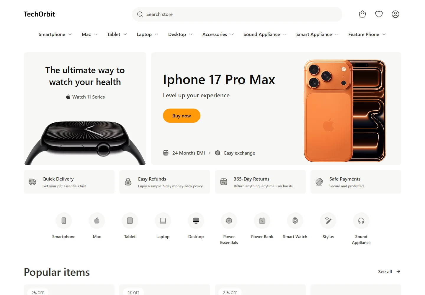
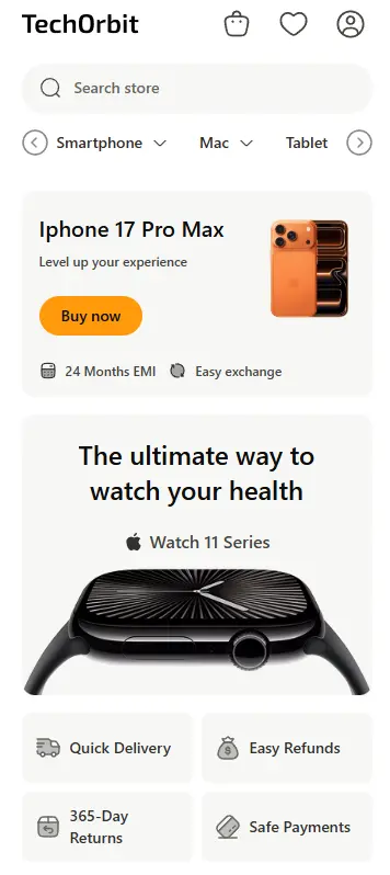
These screenshots were captured from the working TechOrbit demo. The desktop layout prioritizes product discovery and promotion, while the mobile composition preserves search, navigation and shopping actions within a much smaller viewport.
01 · The brief
Modernize the presentation without fighting the platform.
A nopCommerce theme is more than a marketing homepage. It has to support category navigation, product discovery, product cards, search, customer accounts, wishlists, cart updates and the rest of the storefront journey. TechOrbit was built as a complete theme exercise rather than a static visual mockup.
My goal was to create a cohesive electronics-store interface with clear hierarchy, generous spacing and reusable visual rules, while continuing to use nopCommerce's server-rendered storefront and established commerce flows.
02 · Implementation
The decisions behind the theme.
Keep nopCommerce in control
The theme works with the platform's server-rendered pages and commerce endpoints. Presentation changes do not discard the mature customer, catalog and cart behavior already provided by nopCommerce.
Use Tailwind as a design system
Utility classes define consistent spacing, color, typography, responsive behavior and component states. That makes the interface easier to extend than a collection of unrelated page-specific rules.
Design responsive behavior explicitly
The header, category navigation, search controls, product grids and promotional sections each receive layouts suited to their viewport instead of depending on one desktop composition to collapse automatically.
Preserve useful interaction feedback
Custom Ajax cart feedback, quantity badges, horizontal category controls and draggable brand navigation make important store actions visible without turning the theme into a JavaScript-heavy application.
03 · Delivered
Storefront behavior, not just styling.
- Responsive header with search, account, wishlist and cart access
- Scrollable multilevel category navigation
- Promotional hero and merchandising sections
- Reusable product cards and product-list layouts
- Popular, new-arrival and special-offer collections
- Ajax cart confirmation with live quantity feedback
- Testimonial, newsletter and brand-discovery sections
- Desktop, tablet and mobile presentation states
Responsive system
Purposeful layouts
Components adapt rather than simply shrink. Navigation, search and merchandising retain their priority at desktop, tablet and mobile widths.
Commerce integration
Native user flows
Search, category links, account access, wishlist state and Ajax cart feedback remain connected to nopCommerce instead of being replaced by decorative placeholders.
Maintainable CSS
Reusable decisions
Tailwind utilities establish consistent spacing, typography, states and breakpoints across the storefront without copying one-off CSS between views.
04 · Verification
Evidence collected from the working build.
I reviewed the public response as part of this case study instead of describing the project from screenshots alone. The store returns complete server-rendered HTML, exposes the normal nopCommerce catalog and customer routes, and keeps its primary navigation and shopping controls available without waiting for a client-side application to construct them.
- Platform response
- The live homepage returns HTTP 200 with nopCommerce-generated markup and a crawlable sitemap, making the implementation directly inspectable.
- Responsive evidence
- Original captures at 1440 × 1000 and 390 × 844 show how the same content hierarchy adapts across desktop and mobile layouts.
- Interaction evidence
- The rendered storefront includes Ajax cart confirmation, live cart and wishlist quantities, scrollable category navigation and draggable brand discovery.
Before packaging the theme for a third-party marketplace, I would add distribution-specific documentation, installation instructions, compatibility testing and support terms. Those deliverables are intentionally separate from the design and integration work demonstrated here.
05 · What this proves
Theme development requires frontend judgment and platform knowledge.
The difficult part of a custom nopCommerce theme is not choosing a CSS framework. It is understanding where presentation and commerce behavior meet: model-driven views, reusable partials, validation, Ajax responses, plugin output and responsive interaction.
TechOrbit demonstrates my ability to work across that boundary. The result is a live, inspectable storefront that prospective clients can test instead of relying on a list of unverified capabilities.
For a deeper explanation of planning, architecture and delivery, read my guide to custom nopCommerce theme development.
Custom nopCommerce storefronts
Need a theme built around your actual store?
I build and customize nopCommerce themes with responsive interfaces, maintainable code and careful integration with existing commerce workflows.
Discuss your theme project →